Optiek Hoet
Optiek Hoet is an optician in Ledeberg, Ghent, with something most opticians don't have: an in-house lens lab. They cut and fit their own lenses and hand-pick their frames — the whole business is built on craft and considered choice. That's a story worth telling well.
- Type
- Optician · In-house lens lab
- Place
- Ghent, Belgium
- Old stack
- Generic Wix template
- Focus
- Retail
- Pages rebuilt
- 8 captured
- Shown here
- 32 captures
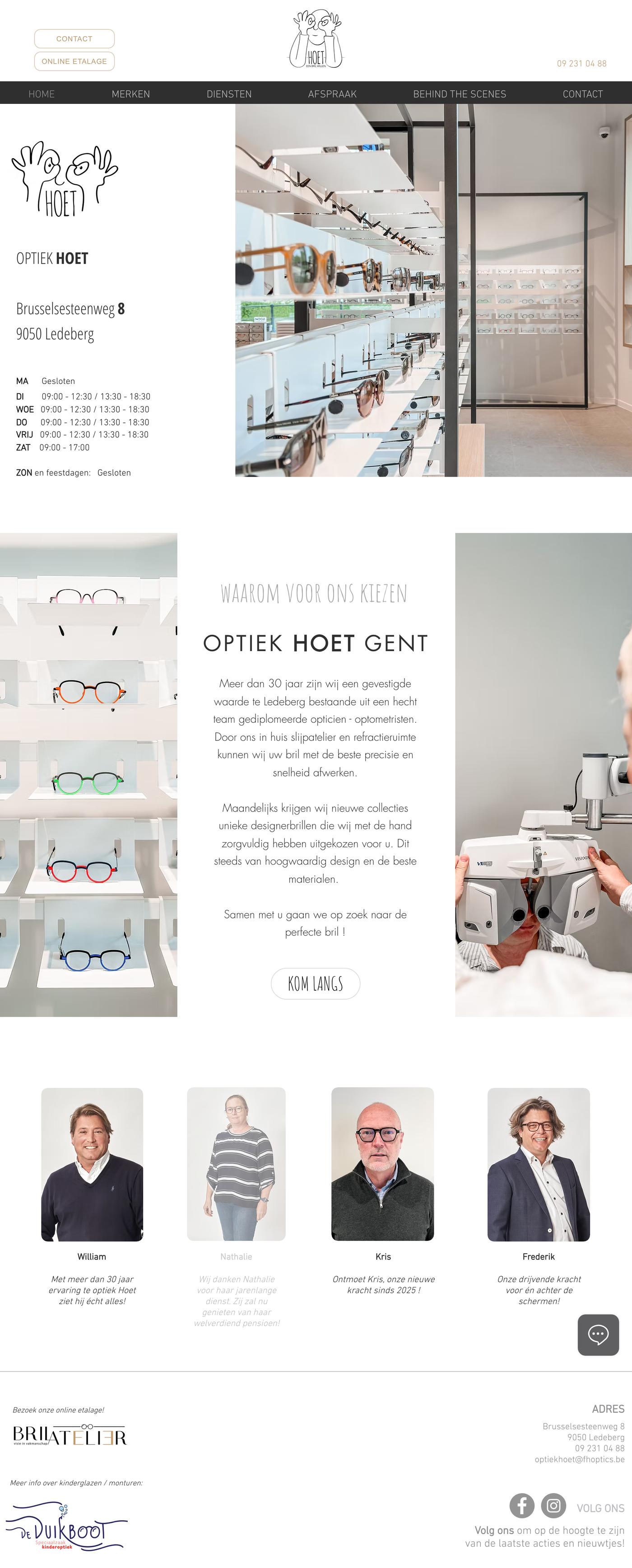
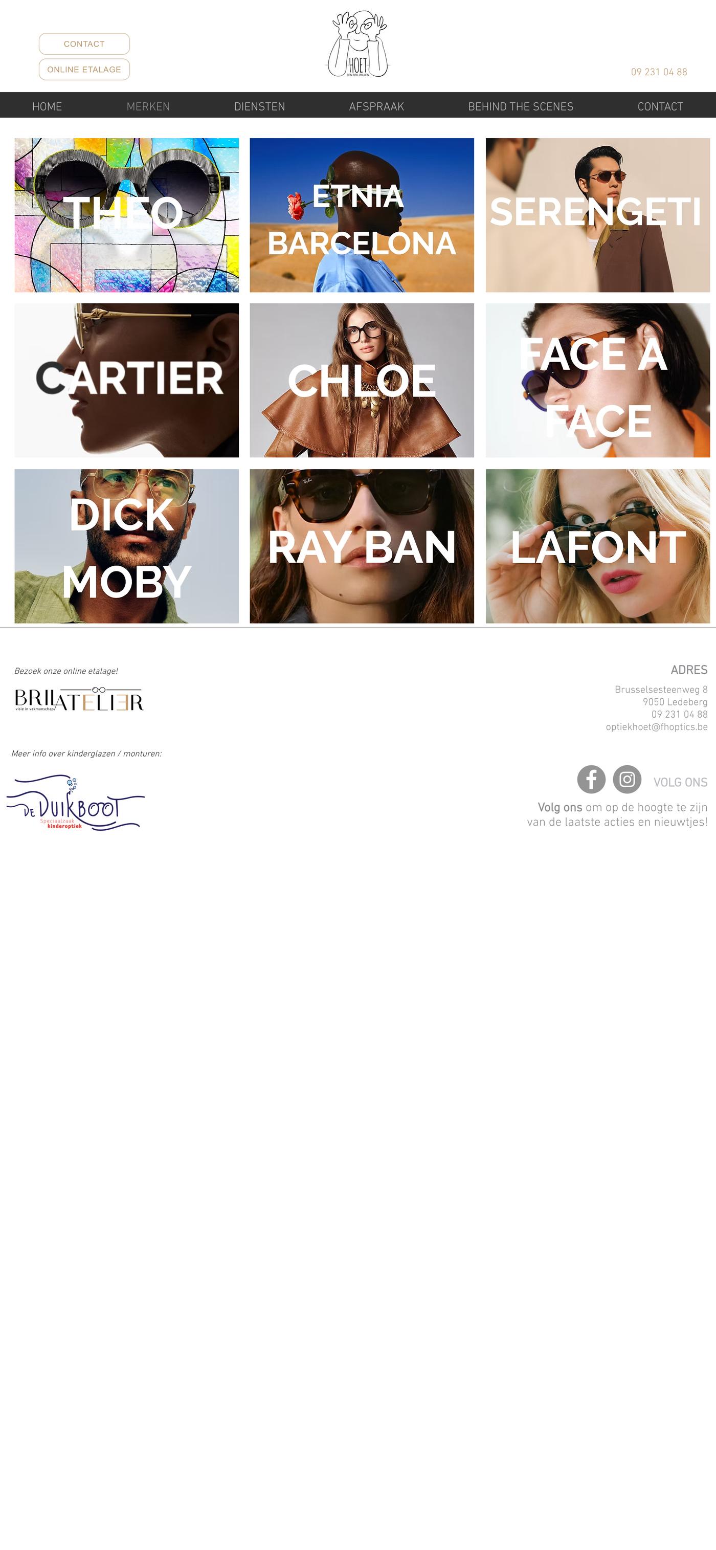
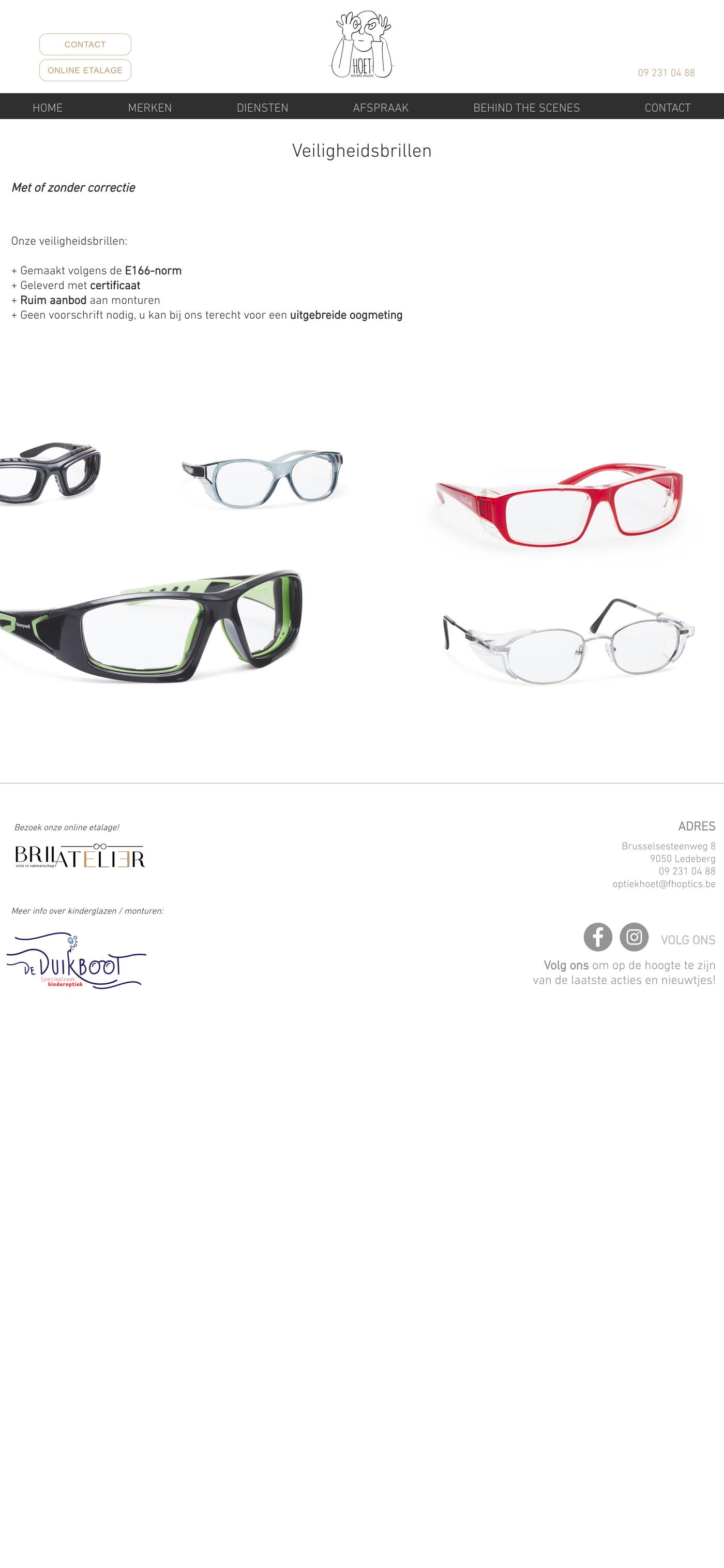
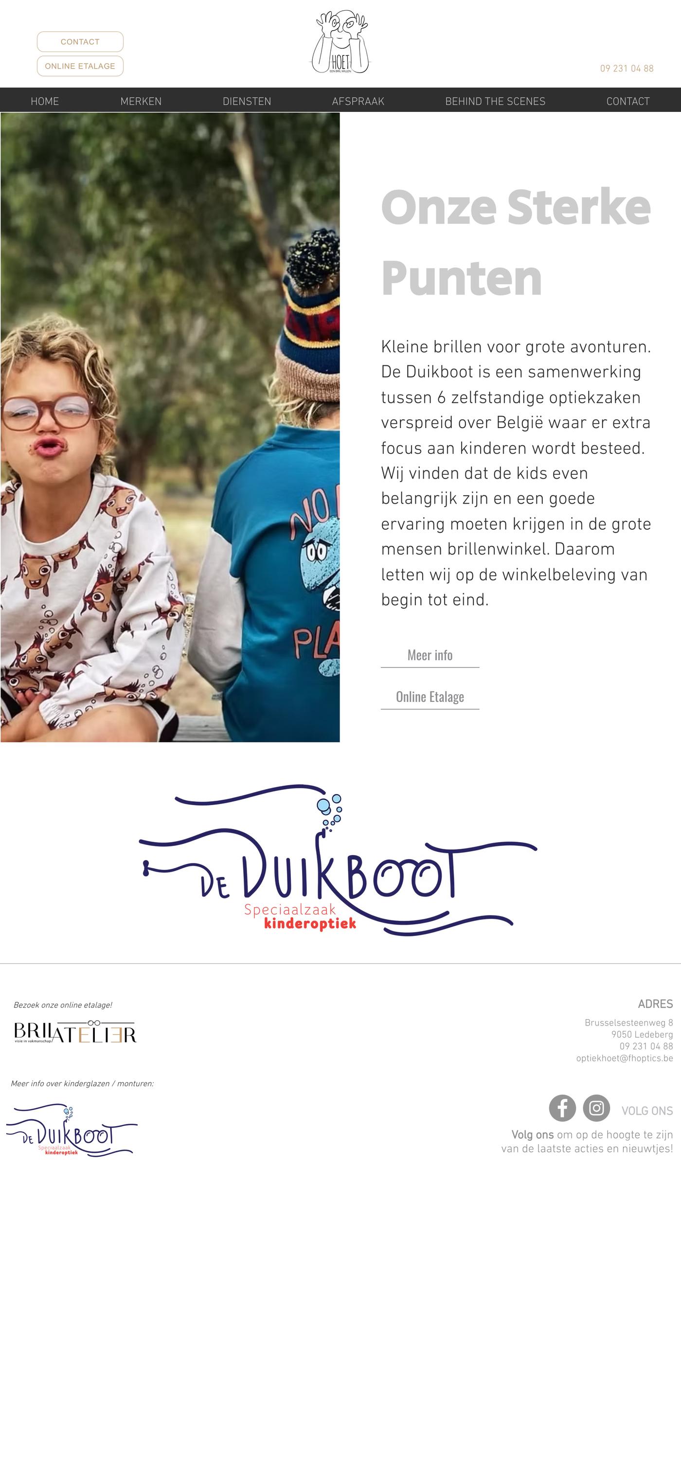
The site wasn't telling it. It was a generic Wix template — clean enough, working fine, but indistinguishable from any other small retailer's page. Nothing on it hinted at the atelier out back or the care in the frames on the shelf. The template flattened a tactile, specialist business into something forgettable.
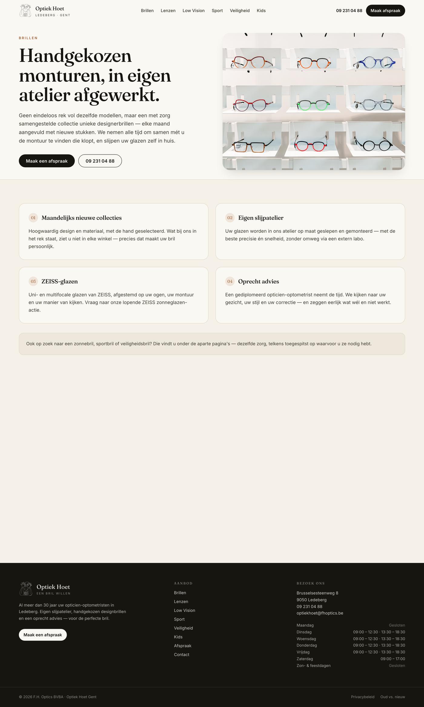
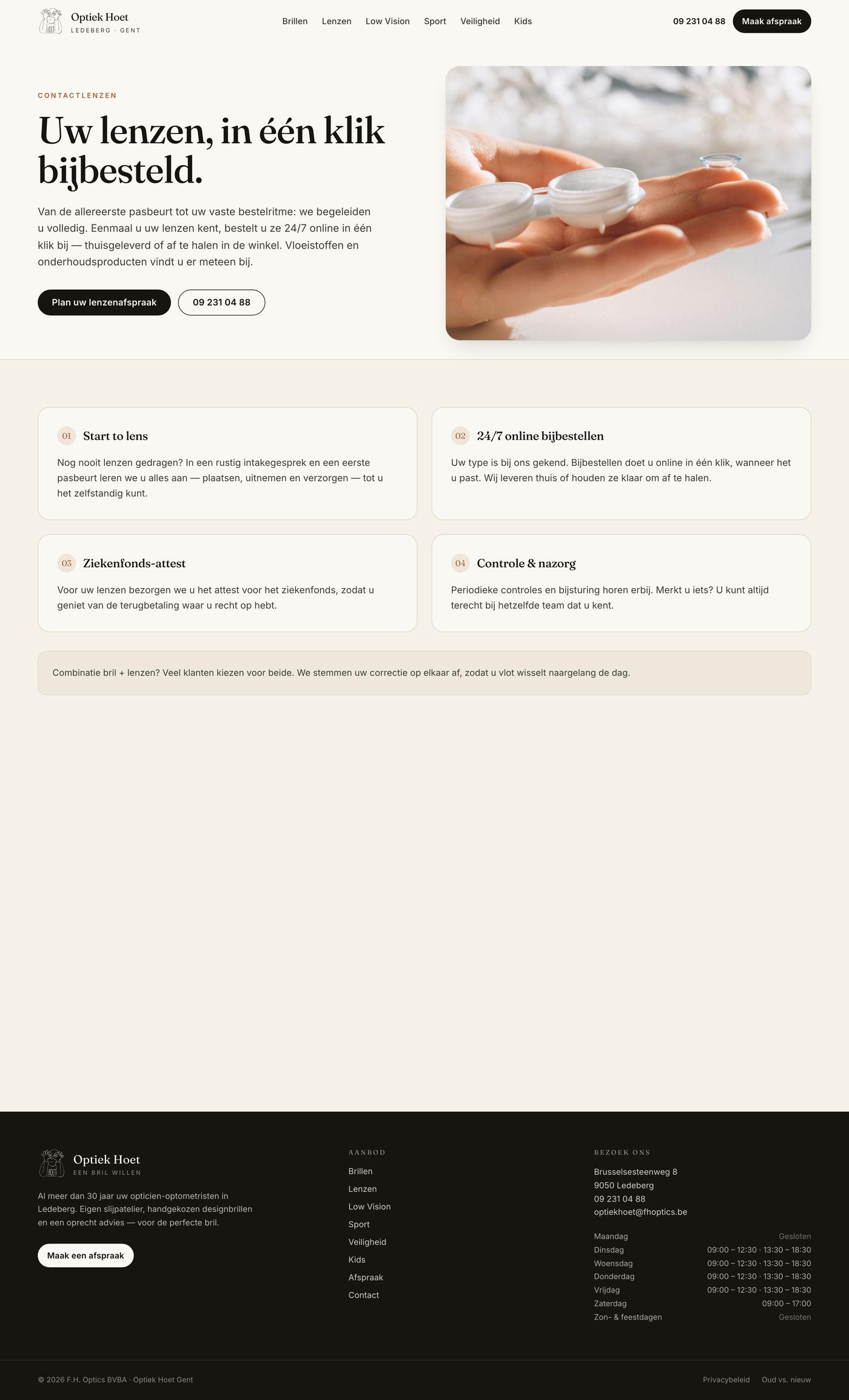
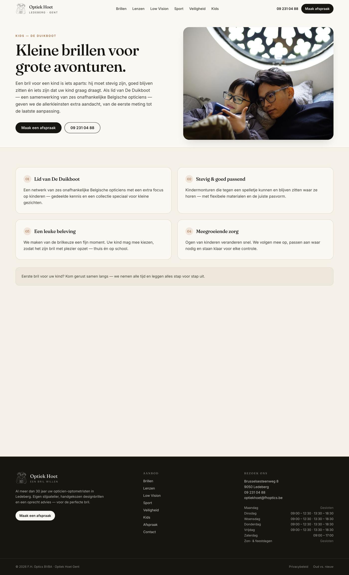
The rebuild replaces that template with an editorial, tactile design system built around the two things that make the place special: the in-house workshop and the hand-picked frames. Service pages carry real value rather than filler, so a visitor understands not just what's sold, but why it's worth coming in for.
Both ways, every page.
Original on the left, rebuild on the right — the same page, the same viewport. A redesign is judged past the homepage, so every page we hold both sides of is here, desktop and mobile.
Home
Before / After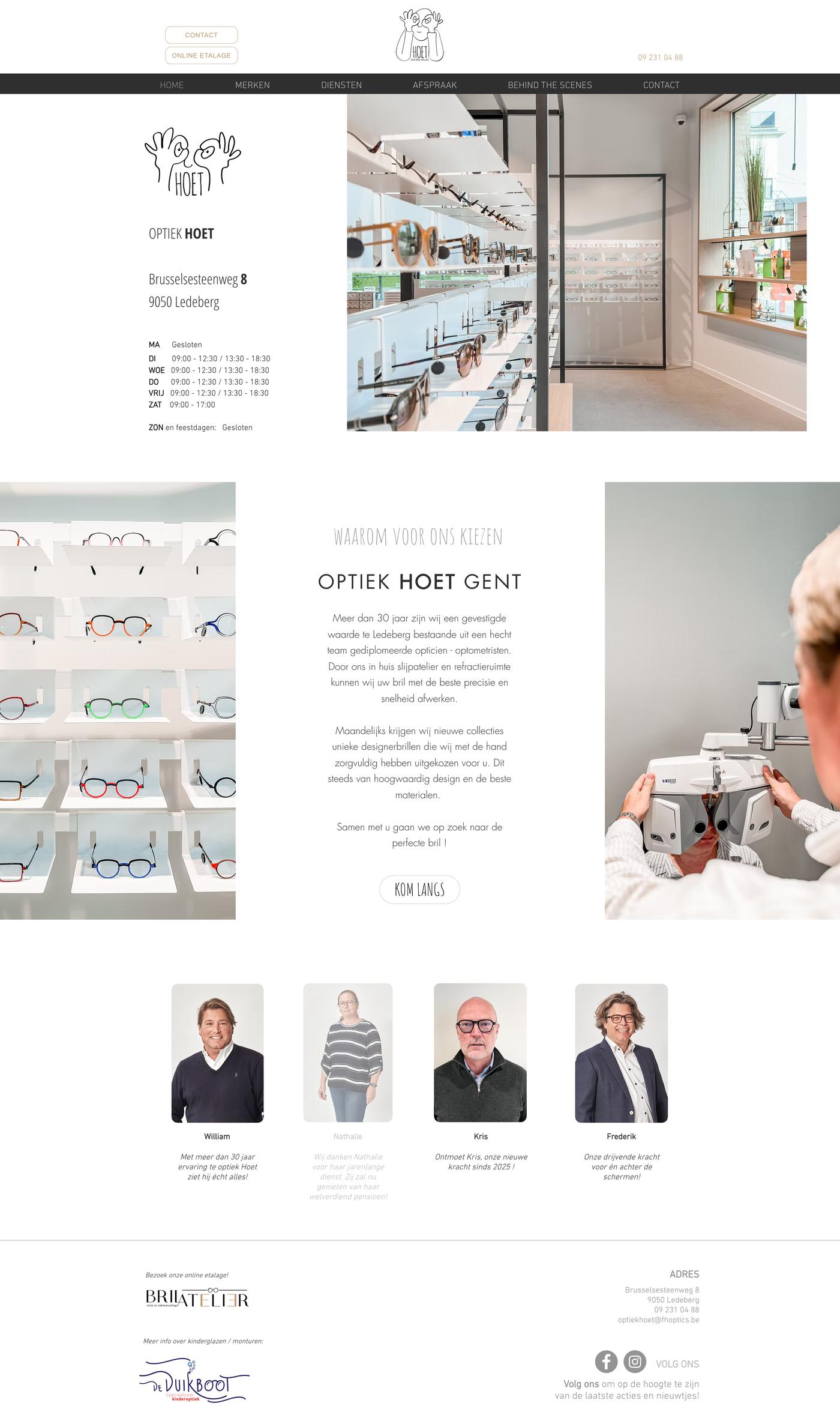
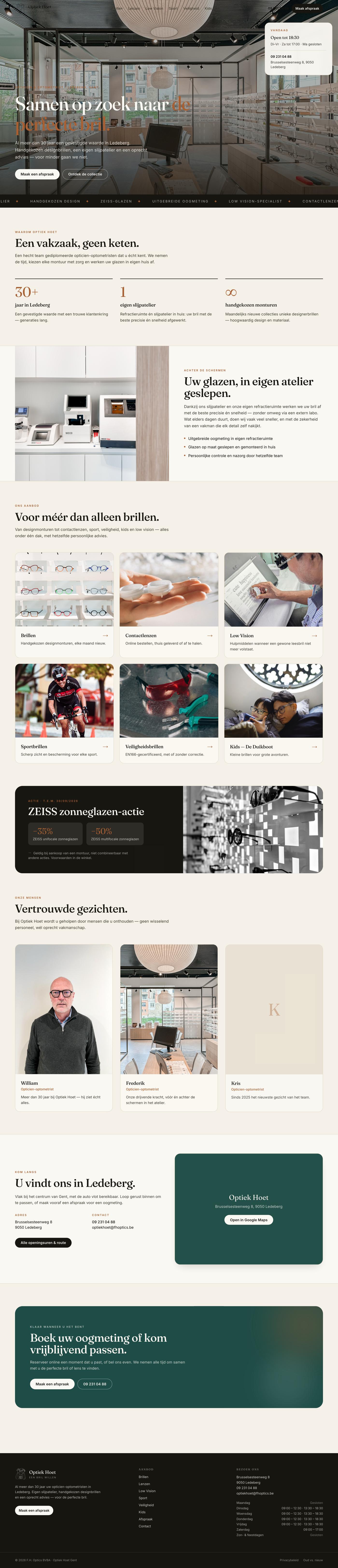

Brillen
Before / After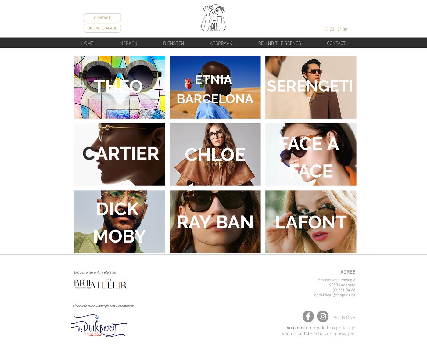

Lenzen
Before / After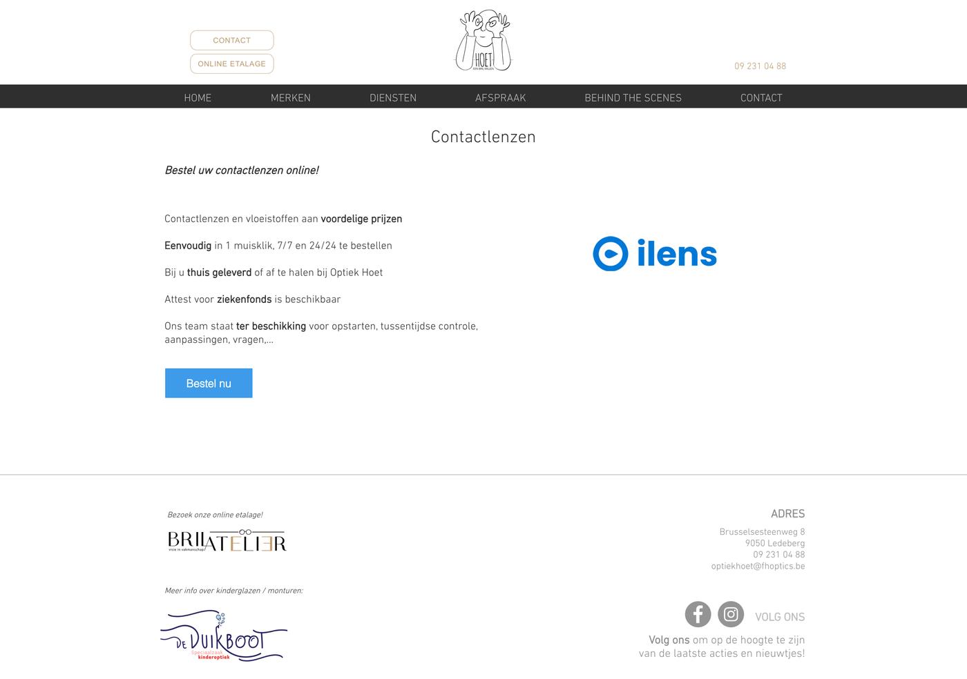


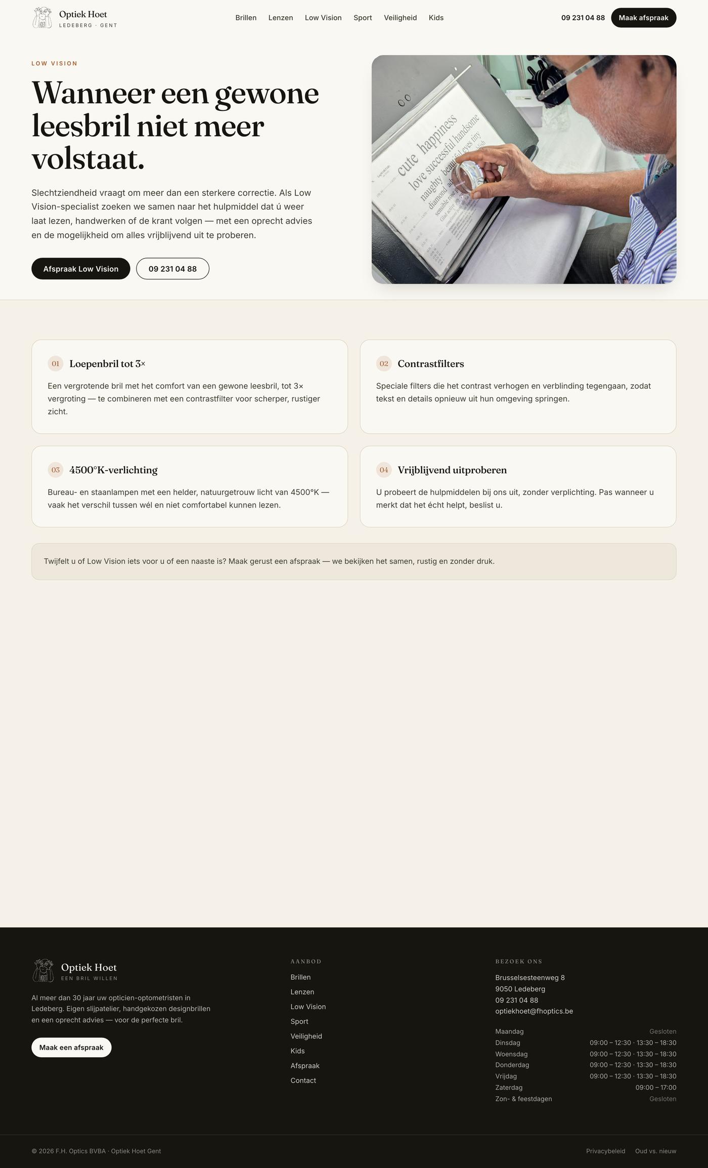
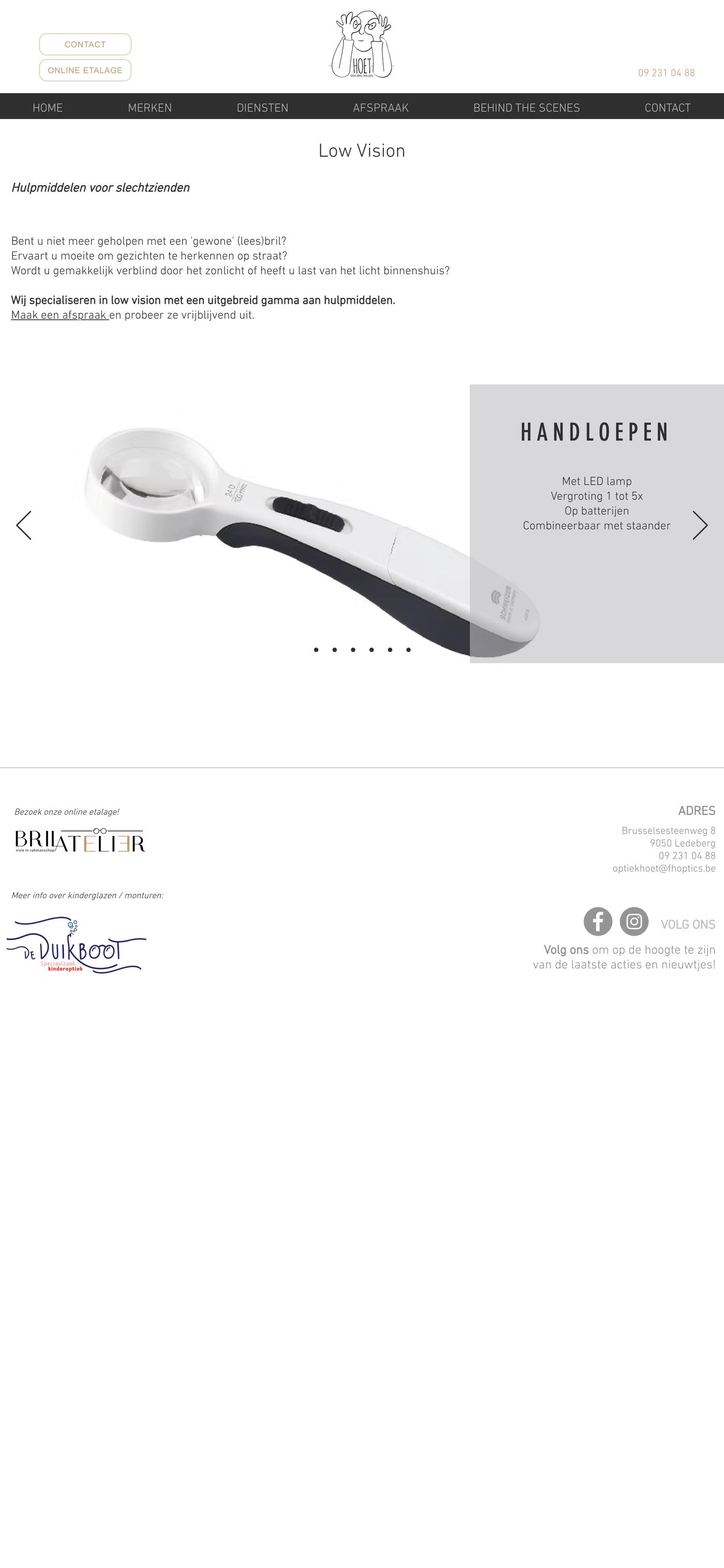
Low Vision
Before / After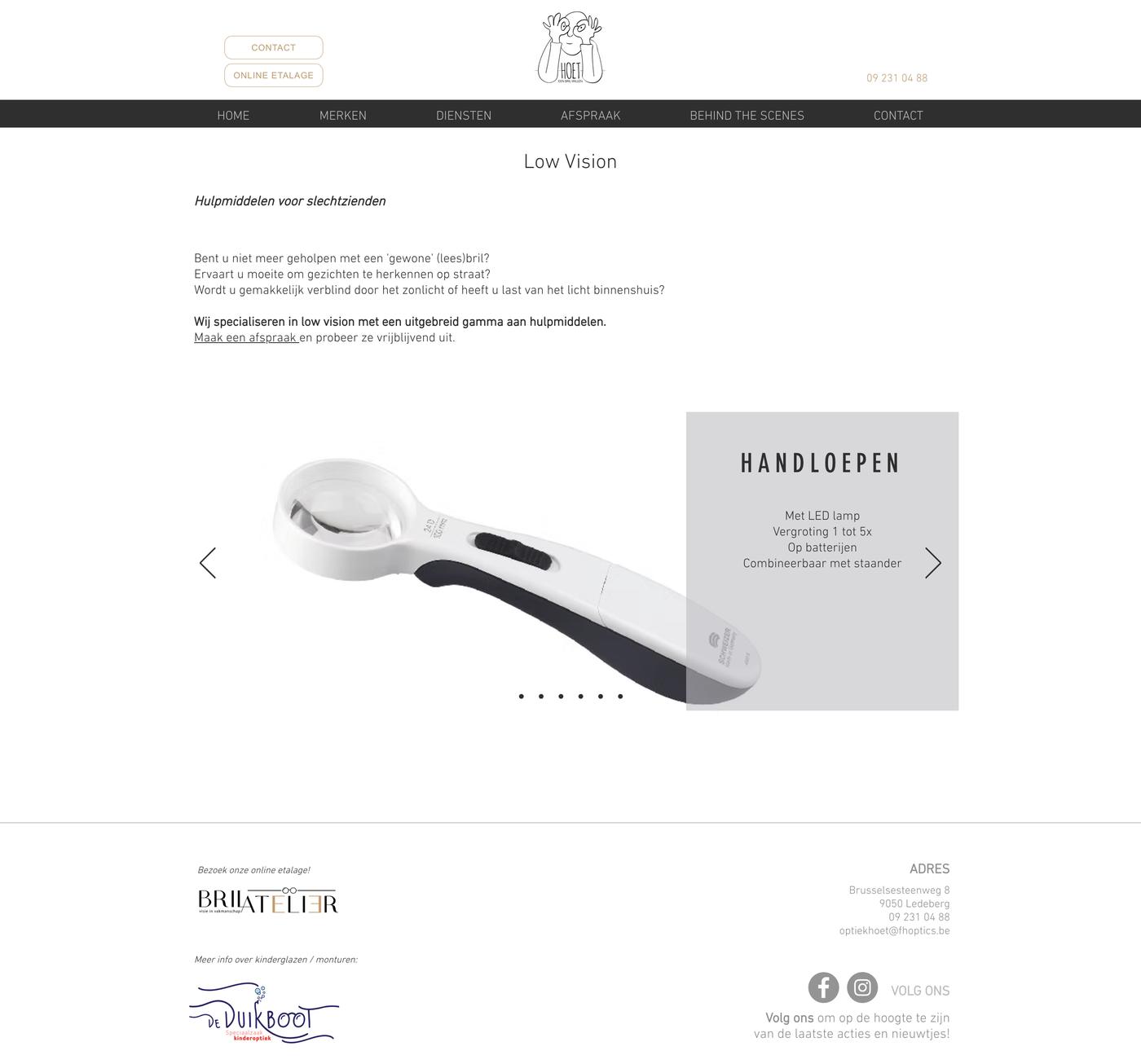

Sportbrillen
Before / After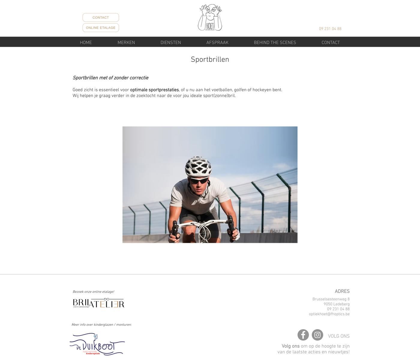
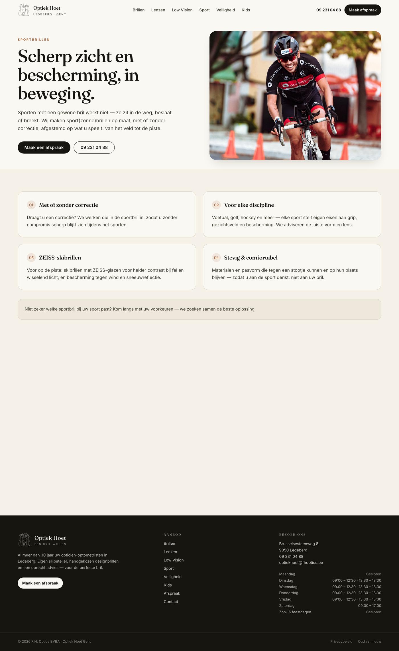
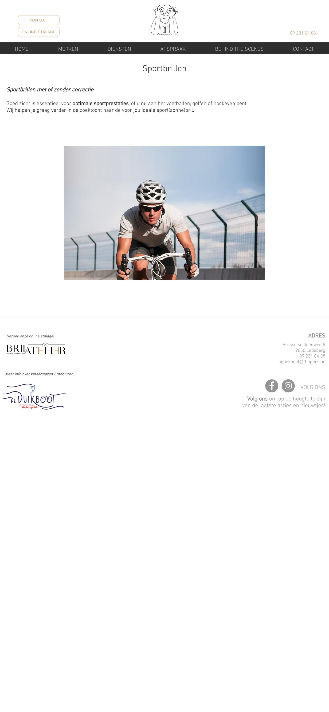

Veiligheidsbrillen
Before / After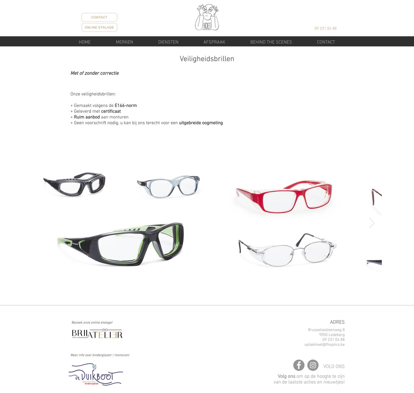
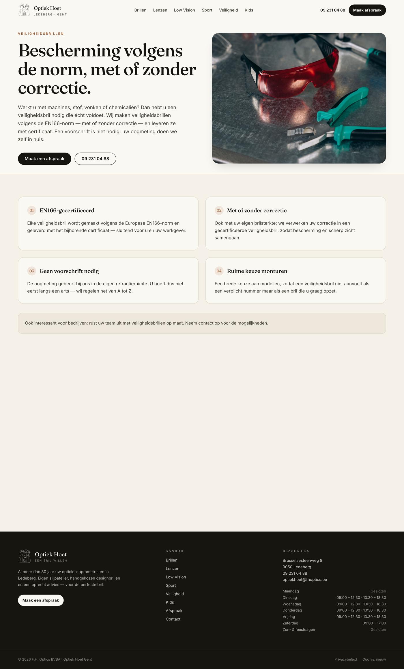

Kids
Before / After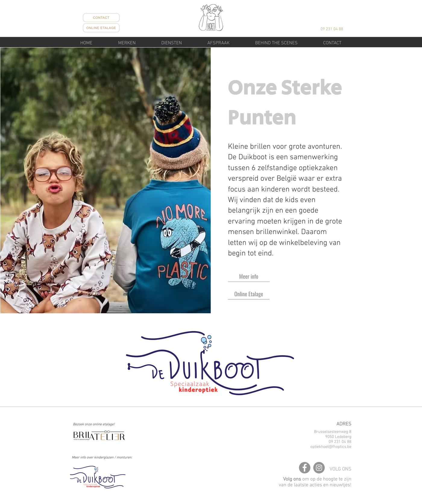

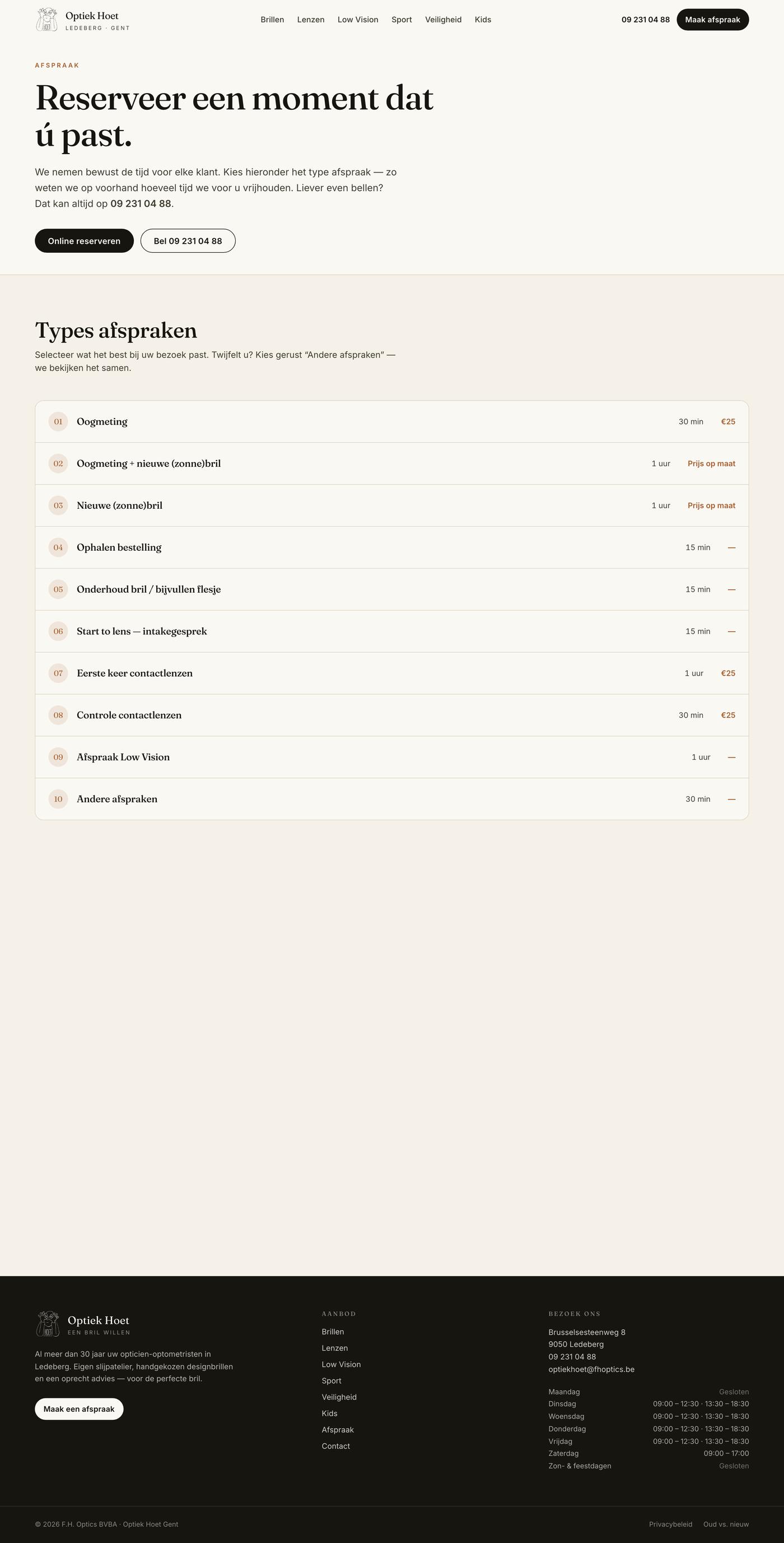
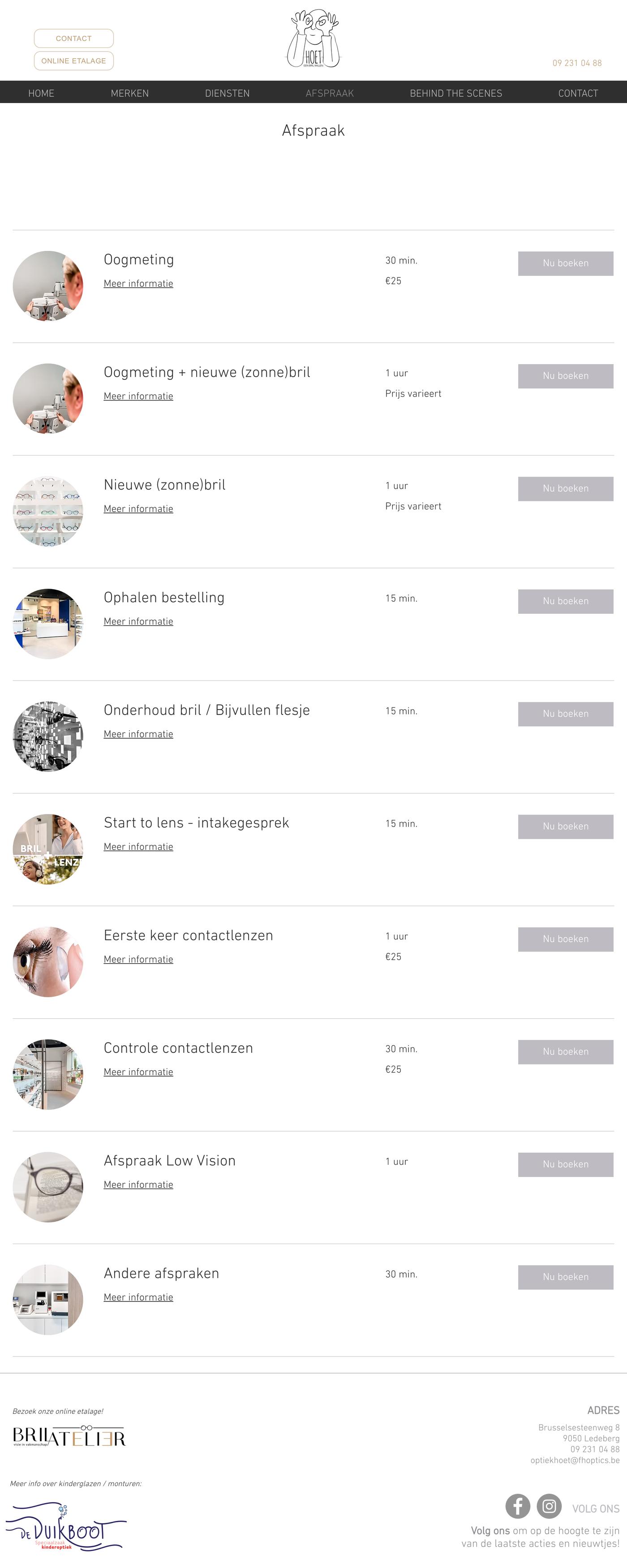
Afspraak
Before / After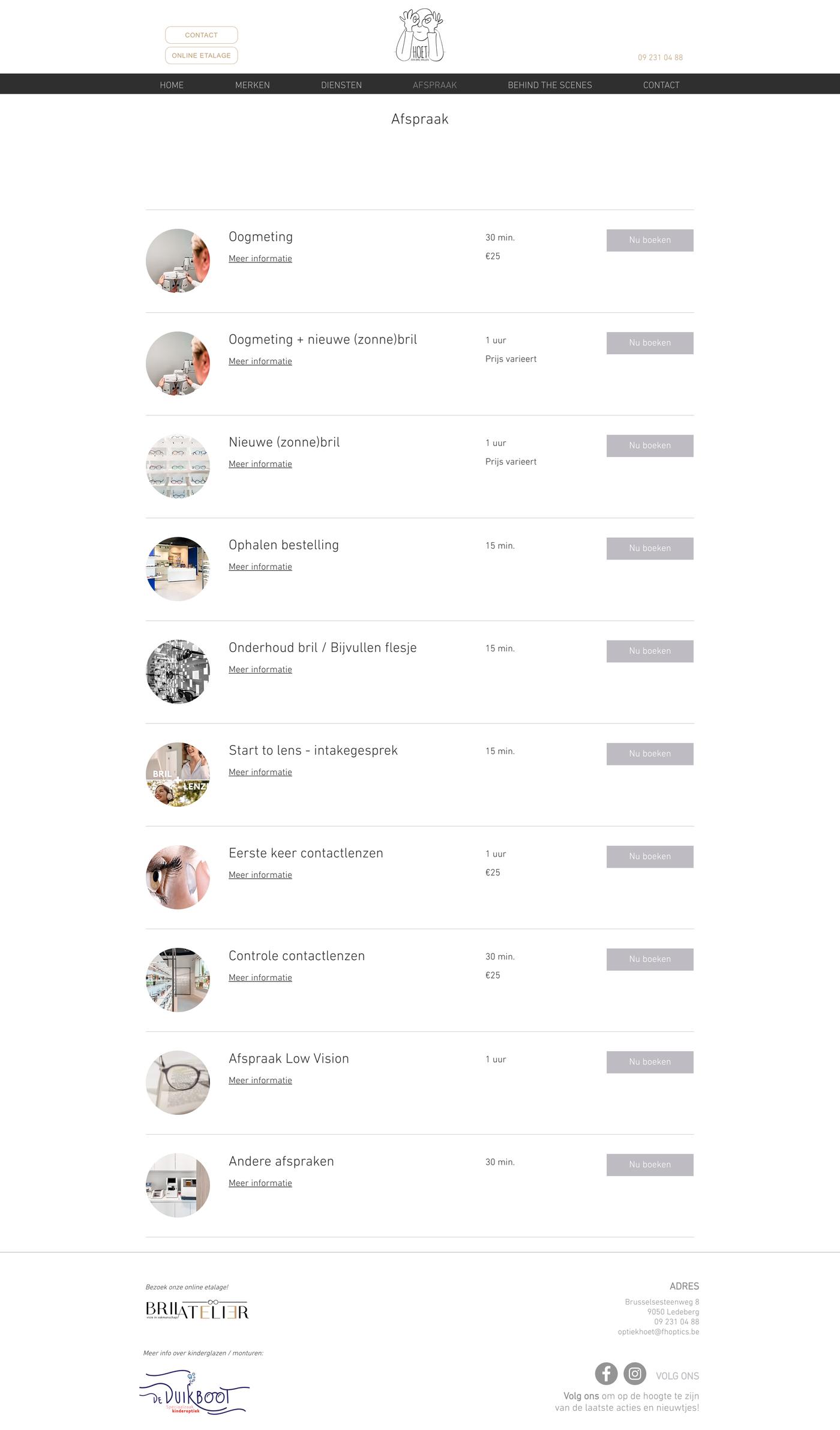

Area by area.
The working notes from the rebuild, unedited — what the original site did, and what replaced it. Written while the work was happening, in the language the site is in.
/brillen is a grid of brand logos with no story; /behindthescenes is blank; sub-pages don't cross-link.Have a site that
needs this too?
If your website no longer matches the quality of the work you do, that is the problem we solve. Tell us about the business and where the site falls short.
Or write to [email protected] — it reaches the same place.